What is it?
prop.kc2g.com provides near-real-time maps and data about ionospheric conditions, for the use of amateur radio operators.
How do I read this?
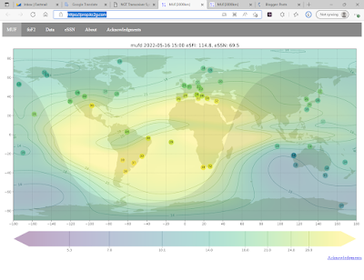
The MUF map shows the Maximum Usable Frequency using colors and contour lines. For example, if a given area on the map is greenish and lies between the contours labeled "15" and "17", then the MUF is around 16MHz in that location. The readings from each individual station are shown as colored dots with numbers inside them, so you can see where the information is coming from. If a dot is faded out, then that station currently has a low "confidence score".
MUF is the highest frequency that is expected to bounce off of the ionosphere on a path 3000km long. So the MUF along a path between two points shows the possibility of long-hop DX between those points on a given band. If the MUF is 12MHz, then 30 meters and longer will work, but 20 meters and shorter won't. For long multi-hop paths, the worst MUF anywhere on the path is what matters. For single-hop paths shorter than 3000km, the usable frequency will be less than the MUF, because higher-angle signals "punch through" the ionosphere more easily. As you get closer to vertical, the usable frequency drops to the Critical Frequency (foF2).
The foF2 page shows a map similar to the MUF map, except that it displays the Critical Frequency (foF2). This one is simpler: it's the highest frequency that you can use for NVIS (skywave communication "in your own backyard"). When foF2 gets up to 7MHz and above then 40 meters "goes short" and can be used for local contacts; if it goes down below 3MHz then 80 meters "goes long" and local stations disappear but far-away ones can still be reachable.
Finally, both maps show which parts of the Earth are in daylight, and which are in the night. Pay special attention to the line dividing day and night (the terminator, or as hams call it, the "greyline"). Unique propagation opportunities are often available when one station, or both, are sitting nearly under this line.
More information about ionospheric propagation can be found in most decent books about amateur radio.
Where does the data come from?
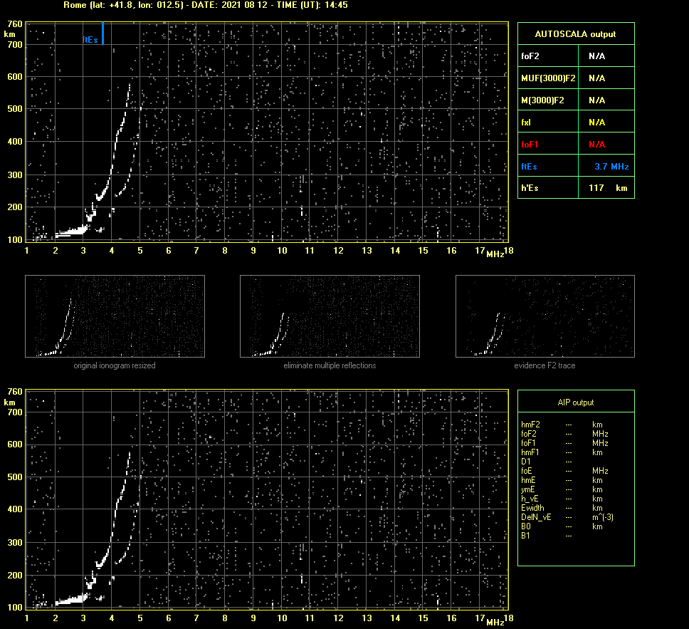
The near-real-time ionospheric data that powers the site is collected by ionosondes (ionospheric radars) around the world, and compiled by the NOAA National Centers for Environmental Information and the Lowell Global Iosnopheric Radio Observatory (GIRO).
The ionospheric phyiscal model for the "IRI" plots is the International Reference Ionosphere 2016, produced by a joint task group of the Committee on Space Research (COSPAR) and International Union of Radio Science (URSI).
Who else is responsible?
The GIRO data fetcher and contour mapper were originally written by Matthew Smith AF7TI and hosted at af7ti.com. Later they were removed from that site, and the code was placed on GitHub. In January of 2019, Andrew KC2G forked the code on GitHub, started making some improvements to the interpolation algorithm, and put the results up on this site.
The code itself relies on Python, NumPy, SciPy, pandas, matplotlib, cartopy, george, Flask, Mojolicious, Minion, PostgreSQL, and many more open-source projects, as well as the aforementioned IRI2016.
How often does the data update?
A new map is generated every 15 minutes, from data which is usually between 5 and 20 minutes old. Therefore, on average, you're looking at something based on measurements taken about half an hour ago. However, we do our best to time-align all of the data (using short-term extrapolation) to the time indicated in the map header.
Why does the map show something crazy/wrong?
Despite the best efforts of the researchers, there are only so many ionosondes in the world making measurements. Most of these are clustered in a few areas of the world, with large areas that are far from any ionosonde. Because of this, the map you see is an interpolation. That is, my code does its best to look at the MUF (or FoF2) at these scattered points on the globe and figure out what it probably is in every other location. I do my best to tweak the algorithm to make it well-behaved, but coming up with an algorithm that can extrapolate from few data points, without getting unreasonable values every now and then, is a difficult problem. While the guessing process is pretty good in areas that are closer to the measurement stations, the uncertainty is much higher in areas that are far away from any measurements. Only the numbers inside colored dots scattered around the map represent actual measured data.
Sometimes the stations themselves provide data that is inaccurate, or disagree with each other. It's not really practical to guess who is right and who is wrong, so the map will show some funny results in an effort to agree with all of the measurements.
Sometimes a station will go off-line and stop providing data, and sometimes a station that was off-line will re-appear. The addition or subtraction of a single data point can cause the model to make some surprising changes in its global picture. This is because it's working with not that many data points to begin with.
Where is the source code?
You can find it at github.com/arodland/prop. Be aware that the NOAA ionosonde data is pushed from their servers, so you won't receive any data from that channel unless you arrange for your own push feed. A fair amount of computing power is also needed to run the full suite of maps and predictions.
I have something to say!
Please send feedback to kc2g@cleverdomain.org.


